Review by Andrew Swafford, Lydia Creech and Zach Dennis
ANDREW: First off, I’m so glad that y’all both joined me for over an hour of avant-garde shorts! I think that watching this kind of stuff intermittently has really given me valuable perspective when it comes to analyzing narrative films, and there’s just so many experiences that avant-garde can offer that don’t fit into any readymade narrative genre.
This program specifically was one of the highlights of the festival for me; this lineup was stacked. Kevin Everson, Jodie Mack, and Apitchatpong Weerasethakul were the big names I was already hyped for, but every short was dazzling. They all played off of each other really well, too: they all took the natural landscape as their primary subject (as the program title suggests), and they all employed more or less the same basic filmmaking techniques to explore it--namely, superimposition and double-exposure, stacking multiple images on top of each other in various ways to make organic matter feel not just alien but completely abstract and immersive.
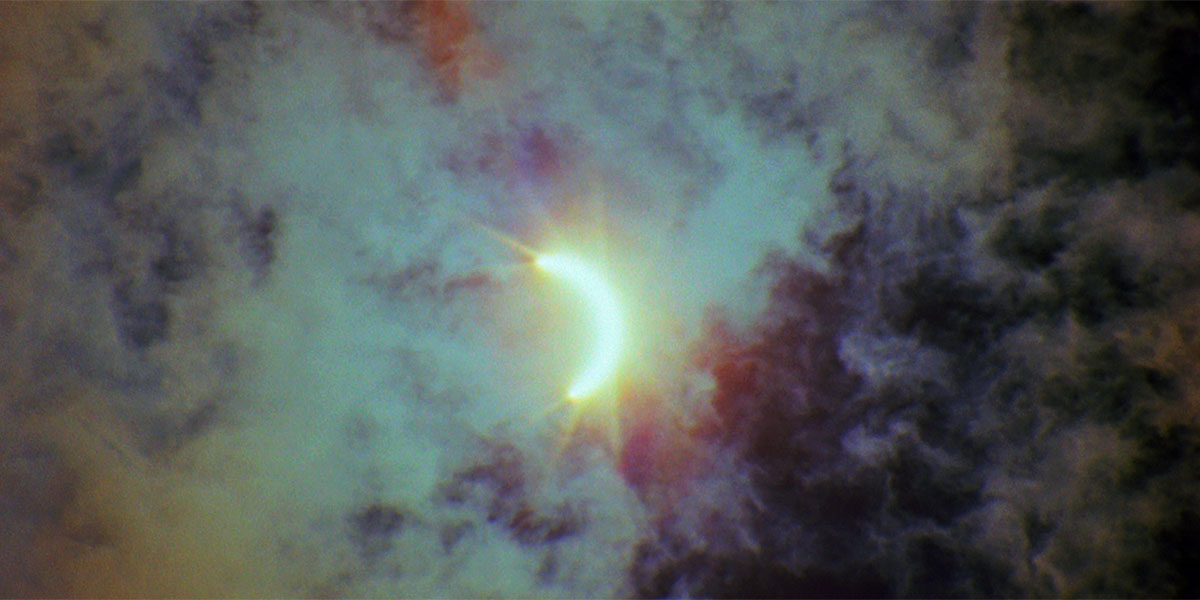
Kevin Everson’s Polly One was a great start to the program. It was a document of the 2017 Solar Eclipse (which I got to witness at the house of Cinematariat Jessica Carr), but Everson takes the opposite approach to what you might expect: rather than showing the sun slowly be hidden, he starts in complete darkness and shows light slowly creeping in. Seeing one beam of light emerge at a time makes for the emergence of some pretty interesting geometric patterns in the angles of light--a perfect example of how cinema can turn real-life images into complete abstraction.
The next film in the lineup was one of my most anticipated: Blue by Apitchatpong Weerasethakul. It stars Jenjira Ponpass, who leads many of Weerasethakul most notable films, like Uncle Boonmee Who Can Recall His Past Lives and Cemetery of Splendour. Here, we mostly see her sleeping under a blue blanket across from a few objects--a campfire, a pane of glass suspended in midair, and an illustrated backdrop that changes a few times. The central image of the film is the slowly growing campfire superimposed over Ponpass’s body, creating the illusion that she’s being burned alive--I couldn’t quite tell if Weerasethakul was using the same technique the entire time, but at least some of it is created by the reflection of the fire in the glass pane being placed directly in front of her body’s image. It was both strangely horrifying and strangely soothing? The definition of slow burn horror. (Weerasethakul has made horror films before, for the record: Mekong Hotel is a vampire ghost ((?)) film and Vampire is, well…) I really liked this, but I couldn’t quite tell what I was supposed to get out of the illustrated backdrop? There is definitely a prominent orange sun featured in the image, and I thought maybe I was supposed to think that it was creating the fire burning Ponpass’s character? But I’m also not sure it matters more than the vibe. What did you guys think of these first two shorts?
LYDIA: The sound design of Blue was what made it soothing for me. It was like burning alive ASMR -- insect noises, fire crackling, the wind, the rustle of blankets as she turns in her sleep.
ZACH: I echo all that. Blue, much as you’ve described with Weerasethakul’s other works, feels otherworldly. There are familiar colors and textures — from her blanket to just the setting she is sleeping in — but it almost feels like it is taking place in some enclosed space outside of anything familiar to this world. The use of superimposition with the fire is almost frightening after a bit as your mind tries to shift between making sense of it being an image and not really on the woman and the opposite. It was one of my favorites of the program for sure.
The next film was Fainting Spells, directed by Sky Hopinka, and this was another that really drew me in. It follows these textures that move around the screen but all the while, a string of text scrolls in different spots, causing you to attempt to focus on both images in motion. It can be a bit disorienting but there is something about vision and speech, and how they work in tandem — especially in movies — that was profound about it. What did you all think?
ANDREW: I loved Fainting Spells! I’m not sure how much of it I can recall in specific, because so much of the film involves these impossible microscopic color compositions with a heavily-zoomed-in camera, making for an experience that’s hard to articulate. One thing that I found really interesting about the short’s editing, though was its use of on-screen text. I have no idea where any of it is sourced from, but Hopinka has this long-running cursive text that slowly scrolls from the right side of the screen to the left throughout almost the entire short. It goes very slowly and the sentences are very long--so slowly that it’s hard to remember what the beginning of the sentence was by the time you get to the end. So eventually you just tune it out and it becomes part of the visual construction of the movie. I especially liked when we got two concurrent lines of text on the very top and the very bottom of the frame--they reminded me of the perforations you see on the side of a strip of celluloid film.
The next film, Prologue to the Tarot: Glenna was an interesting counterpoint to some of the others. Instead of focusing exclusively on the natural world, this is a cinematic portrait of a person. I think I remember the filmmakers explaining in their Q&A something about this being a service they offer to people. But essentially what we’re seeing in this short is this woman lying about, relaxing--many times over. There are so many superimpositions of her fading in and out at different intervals that you stop keeping track of how many discreet images you’re looking at and it all just becomes an indiscernible blur of color and shape, especially when other images are overlaid as well (notably flowers, which is probably what landed the short in this program). What did you guys make of this one or the next few on the lineup?
ZACH: I don’t have much to add on Prologue, but really would like to discuss Hoarders Without Borders, the Jodie Mack film, which was probably my second favorite behind Blue. This film features a wild stop-motion animation style where Mack follows the building up and taking down of a mineral collection with a high frame rate to give it the feel of sustained motion and lightning speed. It almost works like a trance after awhile as you become intoxicated with the motion of the mineral collection gaining and losing height. I’m not as familiar with Mack’s work as you, Andrew, so what did you make of this one?
ANDREW: It has that familar, playful tone you often see in her shorts, both due to its idiosyncratic subject and it’s inclusion of little jokes throughout: because you’re seeing this mineral collection in fast-forward, Mack can sometimes catch you by surprise with the inclusion of something that’s definitely not a mineral in the traditional sense of the word. But then that joke kind of becomes a provocation: who’s to say this bizarre object doesn’t deserve to be in the collection? How do we demarcate what belongs in a category and what doesn’t? It’s definitely something that film critics have to consider a lot when putting complicated films into neat little boxes (“avant-garde” is an incredibly tricky term, for example), but I think it could have even broader implications than that.
The last two shorts--ante mis ojos and ALTIPLANO--were both incredibly beautiful in their simplicity: both were made up exclusively of footage of geographic features and horizons, but they each had a strong aesthetic all their own.
In ante mis ojos, we see a forest surrounding a lake, said to be the lake that inspired the legend of El Dorado. The shots are all zoomed in pretty tightly, and the film stock is very small--it’s Super 8--so the whole thing has a soft, almost tangible earthiness to it. What’s more, the filmmaker Lina Rodriguez has somehow managed to only take in orange light, so the whole landscape kind of blends together in this beautiful haze of not-quite-gold.
ALTIPLANO consists mostly of rolling horizons, and I think a lot of the footage was taken from a car window, so you get this clean horizontal line all the way across the screen--but the twist is that he’s edited in a mirroring effect, so you’re seeing land on both the top and the bottom of the screen, with sky in between. Add in the fact that the camera is constantly moving and you get a fairly disorienting effect, which on the one hand makes our world look like an alien landscape but on the other hand doesn’t make it look like a landscape at all--just a gradient of ever-shifting colors. I dug this a lot.
ZACH: I think the takeaway I most had from this collection of films was how you can have a cohesive experience like this where they all seem to meld together into one form, but also carry such unique personalities. Like we have discussed qualities of most of the films in the program, even though I think we would all admit there was this “oneness” to Earth, Wind & Fire that gave it a feeling of wholeness. I think that’s what I most got out of watching these films — this idea that even when things seem to sift together and become one, there is still a ubiquitous nature to them that sticks in your mind. I may not have loved every short, but I loved the program itself and that’s what I’ll remember when thinking back on the program.
LYDIA: I don’t know how to talk about avant-garde cinema as well as you two, but perhaps with more exposure at shorts programs like this I could learn!


